In this blog we will look at some of the different types of Custom Controls that can be applied to different fields and then look at their behaviours on the forms, building on what has been described in Part 1.
I will not go through every single custom control for every single type of field at this stage but will highlight some really useful high-level fields at this stage. Detailed Custom Controls will be discussed in later blogs.
Field Types
For each Field Type, custom controls that are available to configure on the form can be found by creating the fields, stepping through Part 1 of the blog, and, as previously mentioned “Break:Fix:Repeat”.
Single Line of Text fields
Single Line of Text fields have many formats available when created:
- Text
- Text Area
- URL
- Ticker Symbol
- Phone
The useful ones that I have found are all around the Text and URL SLOT Fields.
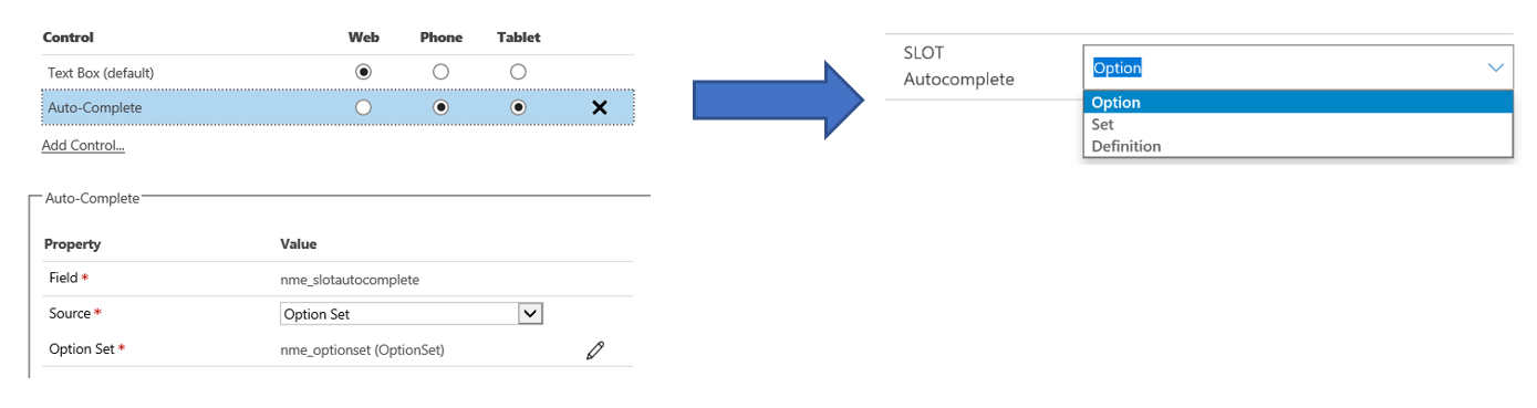
Autocomplete:
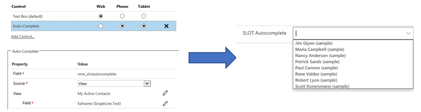
This field needs to be a SLOT Text field and can be mapped either to an option set already configured or to a field in a separate entity. By configuring the AutoComplete field against an option set, the field will automatically display previously configured options etc. If it is mapped to an entity, View and Field it can display a filtered list.
Option Set:
View:
MultiMedia:
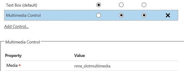
A multimedia Control must be a URL SLOT field and allows you to embed a Youtube video or azure streams on the form. Controls are simple to configure:
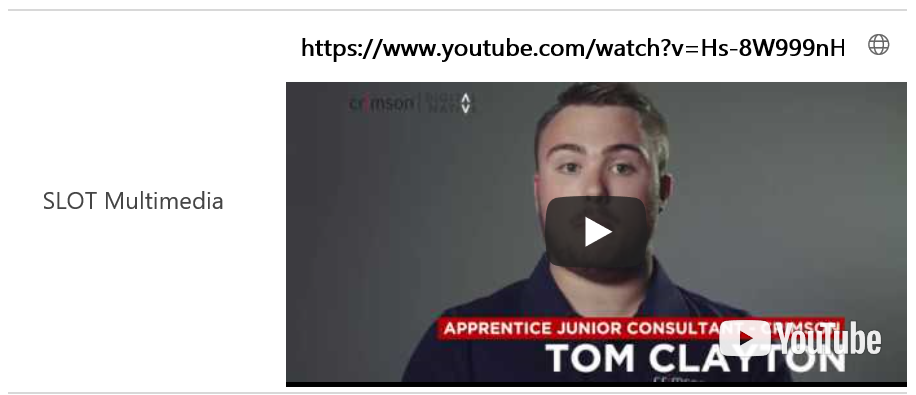
On the form, a URL can be pasted and the video start screen will be displayed and can be played form within the Mobile / Tablet form:
Number fields
The following Controls can be added to ALL Number fields, be that Whole, Floating Point, Decimal or Currency, and can really make a form on a mobile or tablet behave much more intuitively for the end user. I personally really like these and have found them really useful for end users editing Currency fields and the Opportunity entity to be precise. When configured effectively, Sales People seem to pick up the behaviour really quickly.
For any numerical fields, go to custom controls and select any of the following:
Arc Knob
This is defined by providing custom controls for the minimum, maximum and step (the increment, say in steps of 10, from 0 to 100):
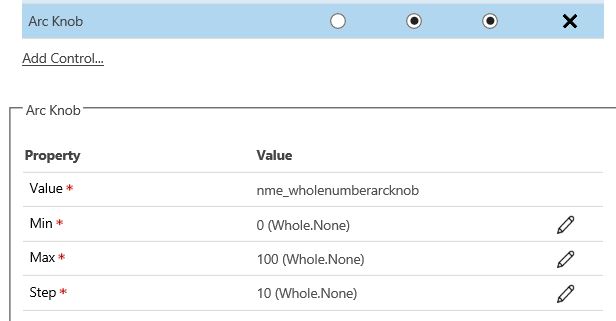
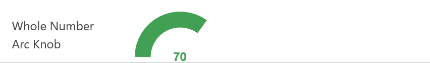
Once configured on the form you can drag the number across and the score will be displayed in an arc. Notes that one drawback is that the arc is completely blank on a new record ergo is not very intuitive on first view:
Bullet Graph
This Custom Control also asks for a Min and Max, but also a Good, Bad and Target rating. Against the fields you can either define against a static field – eg, 100, or bind to a different value on a field on the form. For example, if you were using a “Salesperson’s Gut feel” on an Opportunity you could have 0 to 100, with Bad being under 25, Good being over 75 and Target 100. Or you could define the bullet graph against a Margin field where the margin on an Opportunity could be 0-50 bad is less than 5, good more than 25 and Target is 20.
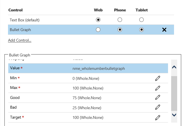
Once configured, the End User can enter the number and the below chart would be updated:
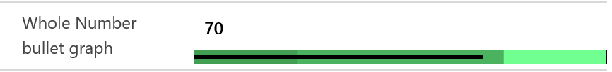
Note, the split between Dark and Normal Green is the “Bad” boundary. The Normal to Light Green is the “Good” and the Black Bar at the end is the “Target”. This would be especially useful for any sales with a margin % field.
Linear Gauge
Linear Gauge is a simple “drag” bar with simple Min, Max and Steps configuration as per the Arc Number:
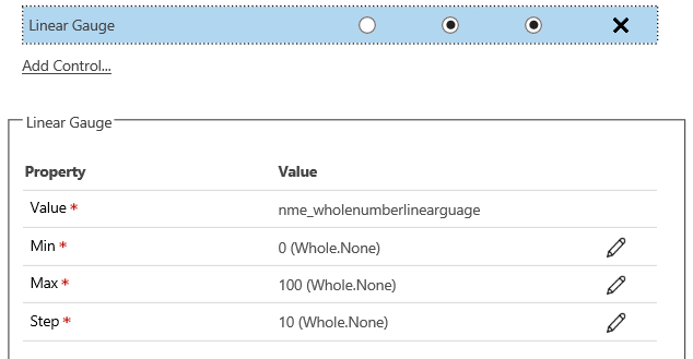
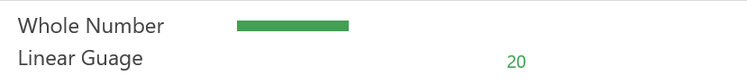
This field looks like this on a mobile:
Linear Slider
This field is extremely similar to above and the Arc, configured with Min, Max and Steps and is displayed as this on the form:

Whole Number Input
Whole Number input allows the end user to enter a number using + or -, increasing or decreasing in defined Steps:
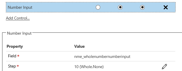
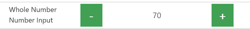
And looks like this on the form:
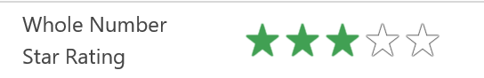
Whole Number Star Rating
This field allows the end user to drag a star rating from zero to a max of 5:
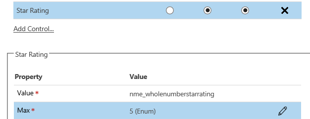
And looks like this on the form:
All of these fields are quite simple to configure and as I keep saying, to get a good handle on them, “Break:Fix:Repeat”.
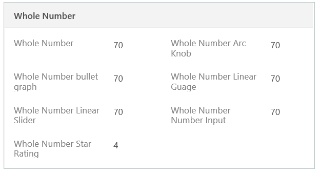
As a comparison, on a form in the browser the fields look like this:
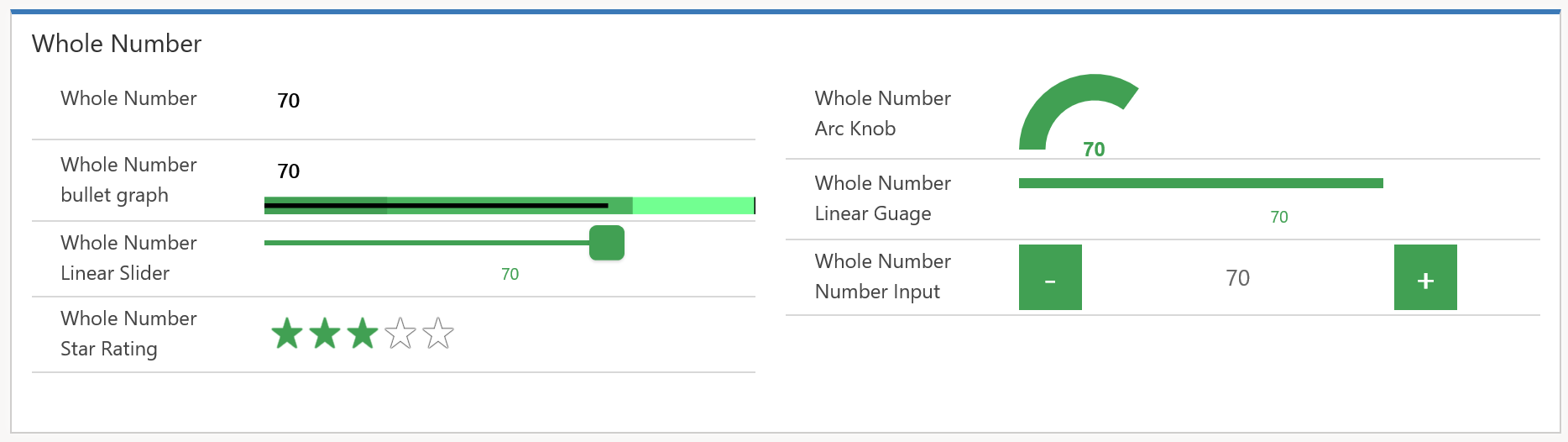
In a mobile or tablet app, like this:
Multiple Lines of Text
There is a brilliant Custom Control that can be applied to Multiple Lines of Text called “Pen Control”. Custom Controls Configuration is simple:
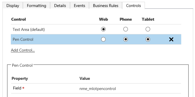
And once on the Mobile form appears as such:
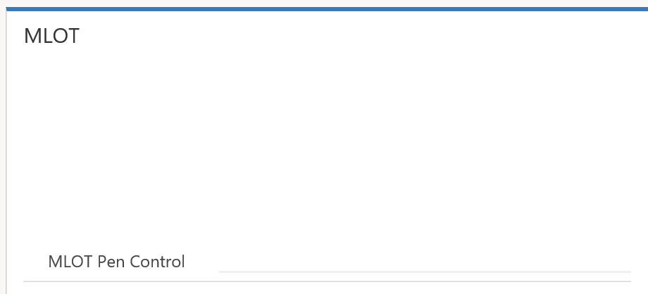
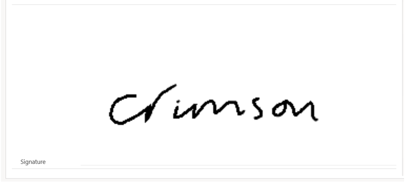
Now, this doesn’t look like its much BUT, it’s a free draw field on the tablet or phone – a perfect place to record a signature on a form:
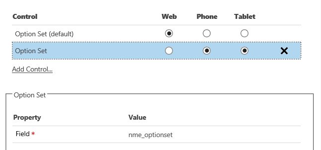
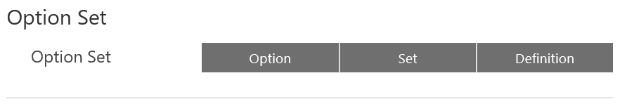
Option Set
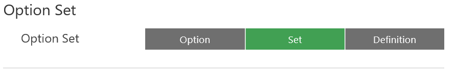
If you have an option set on a form, the Custom Controls allows you to set the Option Set with all options displayed and the user can simply select one of the options available:
In the mobile app the field looks like this:
Selecting one of the words in Grey shows an obvious highlight and is much easier to use than standard Option Sets in the Dynamics 365 Browser:
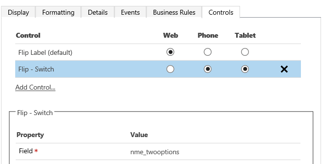
Two Options
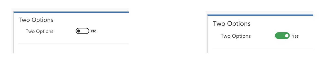
The Two Options field now allows a user to define the 2 options (default yes and no) as a flip switch:
In the app it changes the field to a simple and comfortable switch button:
Summary
Configuring the fields is quite easy, the changes you can make to a mobile app are huge, and you should easily be able to get people more interested in your Dynamics 365 solution and simple and is just a case of, as always with Dynamics 365, “Break:Fix:Repeat”.
Next, we will look at adding this all together to create a simple Mobile App form using one of Crimson’s existing solutions for Health and Safety Assessment.
Read On